
Plenty of visitors but few of them buying? The problem is often the page they land on rather than the traffic. A high-converting landing page is designed for one clear purpose: turning visitors into leads or buyers. According to the Unbounce Conversion Benchmark Report 2024, which analysed more than 41,000 pages with 464 million visits, the median conversion rate across industries is only around 6.6 percent. That leaves a lot of room for improvement, and most businesses are still leaving plenty of opportunities on the table.
The good news is that building a high-converting landing page follows a formula, so you do not have to rely on luck. In this article we look at the seven essential elements that separate a page that merely looks nice from one that actually delivers results, with a simple illustration you can copy for your own business.
Why a high-converting landing page decides how your campaign performs
Imagine you have paid for Google Ads or social media ads, but visitors close the page as soon as they arrive. The ad money is wasted and the potential customer is gone. This is where a high-converting landing page acts as the gatekeeper: it greets visitors with the right message and encourages them to take action. Before going further, it helps to understand what a landing page is and why every business needs one.
Speed is also a big factor. Research from Think with Google found that 53 percent of mobile users leave a site that takes more than 3 seconds to load. So before you talk about design, make sure your page is light and fast. Our guide to speed optimisation with Core Web Vitals is a good place to start.
7 essential elements of a high-converting landing page
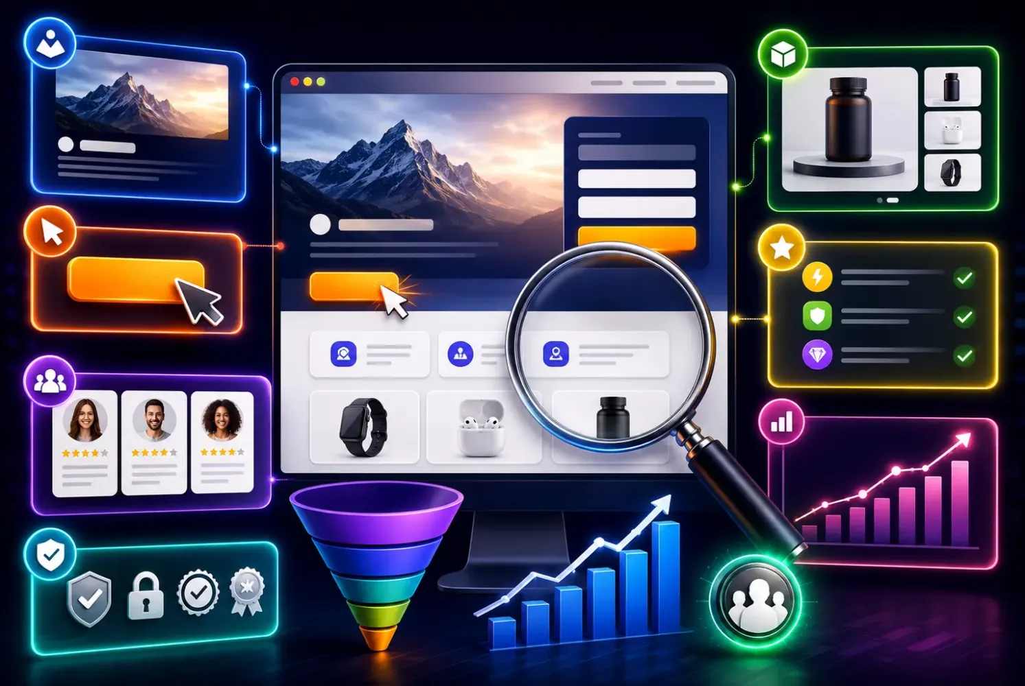
These are the seven core elements found on every high-converting landing page with a track record of results. Apply them one by one and you will see the difference.
1. A headline that speaks straight to the need
The headline is the first thing visitors read, and it often decides whether they stay or leave. A strong headline states the main benefit in one sentence instead of just naming the product. Instead of writing “Interior Design Services”, try “Make Your Home Comfortable in 30 Days, Without the Hassle”. Focus on the result customers want, because that is what makes a high-converting landing page feel relevant from the very first second.
2. One goal, one call to action
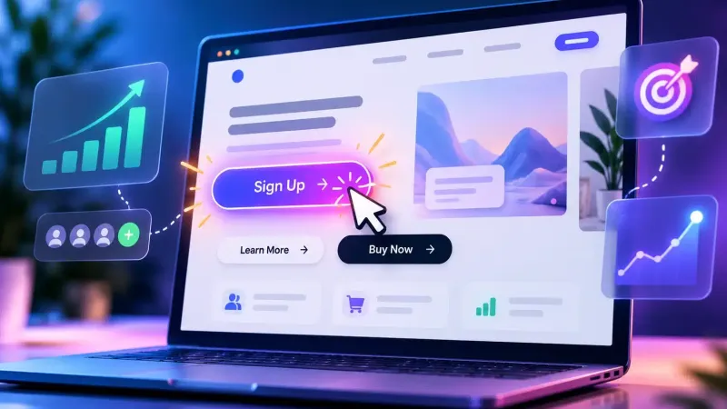
The most common mistake is offering too many choices. A high-converting landing page focuses on a single action, whether that is “Order Now”, “Free Consultation” or “Download the Guide”. The fewer the distractions, the more likely visitors are to click. Make the CTA button stand out with a contrasting colour and clear text. Leave out the navigation menu, which only tempts visitors to wander off to other pages.
3. Convincing social proof
People tend to trust other people's experiences. Customer testimonials, client logos, star ratings or milestone figures (“1,200 happy customers so far”) make buying feel safe. Add real photos and customer names where you can, because testimonials that feel genuine are far more persuasive. These trust signals are often what puts a high-converting landing page ahead of an ordinary page that feels bland.
4. A clean, mobile-first design
With most Indonesian visitors browsing on their phones, a layout that works on a small screen is essential. Use enough white space, readable fonts and a logical flow from top to bottom. A cluttered design confuses visitors and makes them leave quickly. You can explore these principles further in our article on UI/UX design for business websites so your page layout actively supports conversions.
5. A short form
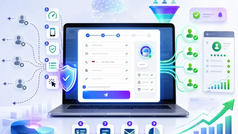
The more fields people have to fill in, the fewer of them finish. Ask only for the information you really need, such as a name and WhatsApp number. A short form removes friction and keeps visitors moving towards completing the action. It is one of the easiest adjustments you can make, and one of the most effective for a page that sells.
If you genuinely need a lot of information, consider a multi-step form that shows only one or two fields at each step. This feels lighter to visitors than being faced with ten fields at once. Test where the form sits as well: placing it near the top of the page sometimes increases sign-ups because visitors do not have to scroll far. Small details like these often decide how a campaign ends up performing.
6. Lightning-fast loading
We mentioned this at the start, but it is worth repeating: slow pages kill conversions. Optimise image sizes, use reliable hosting and keep heavy scripts to a minimum. A page that opens in under 3 seconds looks professional and keeps visitors on it. Without speed, the other elements on the page count for much less.
7. A message that matches the traffic source
If visitors come from an ad promising “50 percent off”, the page they land on must show that discount straight away. A mismatch between the ad and the page makes visitors feel misled, and they leave. Keeping the message consistent maintains trust and ties your ad campaign to the page you have built.
An illustration: reworking a page that tries to do too much
Picture a catering business that uses a single long page containing its menu, company profile, blog and a WhatsApp button hidden at the bottom. Visitors arrive from its ads, but only a few get in touch.
After a rebuild following the seven elements above, the page is trimmed down to one focus: “Healthy Catering for Your Office, Free Delivery”. The headline is sharpened, customer testimonials are added, the form is cut to two fields and the CTA button is made to stand out in orange. Then compare the conversion rate for the month before and the month after the change to see the effect. You can see examples of websites we have built in the Webzoo portfolio.
Notice that the product and the price stay exactly the same. Only the way the page delivers its message and guides visitors changes, and changes like these do not need a big budget. For more tactics, read our complementary article on strategies to increase online shop conversions.
Start building a high-converting landing page for your business
Building a high-converting landing page takes attention to detail, and every element you improve feeds directly into sales. Start with the easiest changes: sharpen the headline, shorten the form and speed up loading. From there, test the other elements one by one while you watch the numbers. If you would like help designing a page that delivers results, Webzoo's professional website development team can support you from design through to optimisation. With the right approach, a high-converting landing page becomes a growth engine that works for you every day.