
Imagine a shop with a beautiful window display and plenty of visitors, but no till and no sign telling people how to pay. That is what happens on many business websites without a clear CTA button. Visitors read, nod along and then leave without getting in touch or buying anything.
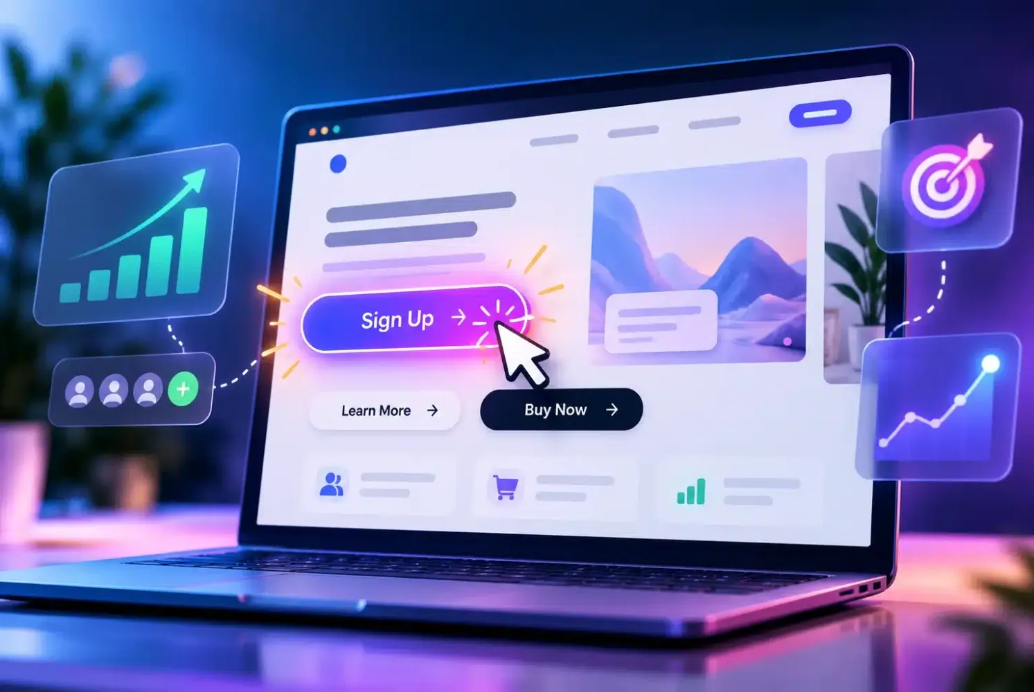
A CTA (call to action) button invites visitors to take one next step, such as “Contact Us”, “Order Now” or “Request a Quote”. In this article we cover seven CTA button best practices for designing buttons that are clear, easy to find and actually get clicked, with the latest test data so your decisions rest on more than personal taste.
Why the CTA button decides what your website achieves
A website without a clear call to action is like a brochure without a phone number. The content may be good, but visitors do not know what to do next. That is why the CTA button is often the deciding point between someone who just passes through and someone who becomes a customer.
The data is fairly consistent. Unbounce's analysis of 18,639 landing pages found that pages with one main call to action converted at 13.5% on average, while pages with three or more managed only 10.5% (Unbounce, 2026). So how focused your offer is matters as much as how the button looks.
Method 1: Set one main goal per page
Before you think about colour or shape, ask yourself what single thing you most want visitors to do on this page. On a service page, the goal might be a WhatsApp enquiry. On a product page, it is a purchase. One page, one main CTA button.
You can still include secondary links, but give them a quieter style, such as an outline button or a text link. That way visitors can see at a glance which button matters most. The same principle applies to a high-converting landing page: one page, one goal.
Here is a quick test: show your page for five seconds to a friend who has never seen it, then ask what they remember and what they think they should do next. If the answers vary or they look confused, your page's message is not focused yet. Fix the message before adjusting the design, because a good-looking button cannot rescue a confusing call to action. It also helps to write down the goal of each page in one short sentence before designing it, so the whole team works from the same brief.
Method 2: Write specific, benefit-led button text
“Submit” or “Click Here” gives visitors no reason to act. Compare them with “Get a Free Quote” or “Order Now, Shipped Today”. Specific text tells visitors what will happen after they click, which reduces hesitation.
Start with a verb, keep it short and state the result. Examples of clear button text: “Free Consultation on WhatsApp”, “See Our Price List” or “Try It Free for 7 Days”. Avoid words that are too generic, because they give visitors no reason to click.
Method 3: Test “my” versus “your” in the button text
There is a well-known experiment by Michael Aagaard at Unbounce in which the button “Get my free 30-day trial” was tested against “Get your 30-day trial”, and the first-person version recorded an increase in clicks of around 90%. Results like this do not always repeat on other websites, though.
The lesson is simple: do not take a single test result at face value. Try two versions of the text on your button, let them run for a few weeks, and keep the one that gets more clicks on your own website.
Method 4: Use a contrasting colour that everyone can read
The biggest myth about buttons is that there is a particular “magic colour”. What has been shown to matter is contrast: the button has to stand out from the background and the elements around it. An orange button on a mostly orange page will disappear, while the same button on a blue page is immediately visible.
Contrast is also about readability. The annual WebAIM Million report keeps finding low-contrast text on most of the home pages it studies. Make sure the text inside your CTA button stays clearly readable, including for people with tired eyes or viewing the screen in bright sunlight. You will find the full guidance in our article on website accessibility.
Method 5: Place the button where visitors' eyes stop
Put one CTA button near the top of the page so it is visible without scrolling, then repeat it at the end of key sections, for example after the benefits or after the testimonials. Do not wait until visitors reach the footer to offer the next step.
There is an exception for products or services that need a lot of explanation. On a long page that has to persuade, a button at the bottom, after every reason has been laid out, sometimes converts better. Match the position to how much information visitors need before they are ready to decide.
Method 6: Make the button easy to tap on a phone
Most visitors to Indonesian business websites arrive on a phone. A button that is too small, too close to other links or covered by a banner leads to mis-taps and annoyed visitors. Give it enough size, generous spacing and text that is not cut off.
Consider a button that sticks to the bottom of the phone screen for the main action, such as a WhatsApp chat. As long as it does not cover important content, this pattern keeps the call to action within reach at all times. Check that your website is already mobile friendly before changing the button design.
Method 7: Test, measure and improve your CTA button regularly
One small change to a button can raise or lower your results, so do not change everything at once. Change one thing per period: the text first, then the colour, then the position. Record the number of clicks and messages received before and after each change.
Use the data you already have, such as button clicks in Google Analytics or the number of WhatsApp chats per week. HubSpot analysed more than 330,000 calls to action and found that CTAs personalised to the visitor performed far better, around 202% better than generic versions (HubSpot). A button that is relevant to what the visitor needs almost always wins.
Common CTA button mistakes that often slip through
Some mistakes come up again and again on small business websites. One is having too many buttons in the same colour, so none of them stands out. Another is button text that does not match the page, such as a “Buy Now” button on an educational page. A third is a button that leads to a broken page or a form that is far too long.
Check what happens after the click as well. A good button is wasted if visitors end up at a form with ten fields. Tidy up the path from the click to the sent message, and find out how to improve your business website navigation so the steps are easy to follow.
Final thoughts: start with one clear CTA button
You do not need to redesign your entire website to improve its results. Start with your most important page: set one goal, write specific text, choose a contrasting colour and measure the results. A clear CTA button is one of the smallest-budget fixes you can make to turn visitors into customers.
If you want a website designed from the start to guide visitors towards taking action, our team can help through Webzoo's website development service. You are welcome to start with an informal chat, free of charge.