

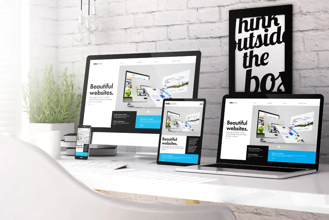
Mobile-first design is no longer a future trend. In 2026 it is a standard every business website needs to meet. Most Indonesian internet users access the web on a smartphone, and Google officially uses the mobile version of a website as the main basis for indexing and ranking. This article explains why a responsive website is an absolute must and how to make sure yours works well on every device.
Key points in this article
- Most Indonesian internet traffic comes from mobile devices, so a website that is not responsive loses most of its potential customers
- Google has applied mobile-first indexing to every site since 2023: the mobile version of your website is what gets assessed for SEO rankings
- According to Google research, 53% of mobile visits are abandoned if a page takes longer than 3 seconds to load
- Mobile-first design goes beyond fitting the screen: it means designing an experience optimised for thumbs and touch
- Improving the mobile experience is one of the most direct ways to raise your business website's conversions
- How Much Does a Professional Website Cost in Indonesia in 2026?
- WordPress vs a Custom Website: Which Suits Your Business Better?
- 7 Fatal Mistakes When Building a Business Website and How to Avoid Them
What is mobile-first design and why does it matter?
Mobile-first design is an approach to website design that starts with the mobile experience (small screens, touch interfaces, connections that may be unstable) and only then expands to desktop. It differs from the older approach of designing for desktop first and then 'shrinking' the design for mobile.
Google Mobile-First Indexing, which has applied to every site since 2023, means that if the mobile version of your website is poor, your Google rankings suffer, even for searches made on desktop. That makes it a fundamental SEO issue as well as a UX one.
The real impact of mobile-first design on Indonesian businesses
Neglecting the mobile experience costs you revenue as well as traffic. The general picture in Indonesia:
- Most web traffic comes from mobile devices
- Many e-commerce transactions are made on smartphones
- Visitors quickly leave websites that are hard to use on a phone
- Websites that work poorly on mobile risk losing organic traffic, because Google assesses the mobile version
Businesses whose websites are easy to use on a phone have a better chance of winning leads than competitors whose websites are not yet responsive, even when their offering and prices are similar.
Mobile-first design principles to apply
1. Prioritised content
A small mobile screen forces you to decide what information really matters. In mobile-first design, prioritise content by its value to users. The most important information should be visible without scrolling, call-to-action (CTA) buttons should be clearly visible, and non-essential content can be hidden or moved further down.
2. A touch-friendly interface
Fingers are not mouse pointers: buttons and links must be big enough to tap comfortably. Google recommends touch targets of at least 48x48px with at least 8px of spacing between interactive elements. A clear hamburger menu, large CTA buttons and forms that are easy to fill in with a mobile keyboard are key parts of touch-friendly design.
3. Typography that is easy to read on small screens
Use a minimum font size of 16px for body text on mobile: anything smaller forces users to zoom and spoils the reading experience. A line height of 1.5-1.7x the font size, sufficient colour contrast (at least 4.5:1 for normal text, in line with WCAG) and short paragraphs (3-4 sentences) improve readability on small screens.
4. Fast loading
Mobile users are often on slower connections (4G rather than WiFi). Optimise for these conditions: compress images aggressively (WebP/AVIF), lazy-load images below the fold, minimise render-blocking JavaScript, and use Service Workers for smarter caching on mobile.

How to check your website's mobile-friendliness
Several free tools help you evaluate the quality of your mobile website:
- Lighthouse (in Chrome DevTools): audit a page in mobile mode, including performance and accessibility. Google's Mobile-Friendly Test was retired in December 2023
- Google PageSpeed Insights: measure mobile performance and get specific recommendations
- Chrome DevTools Device Mode: simulate how your site looks on various mobile devices directly in your browser
- BrowserStack (paid): test on real smartphones from various brands and operating systems
- Google Search Console, Core Web Vitals report: how your pages perform on mobile, based on real user data from your website
Common mobile design mistakes on Indonesian websites
- Text that is too small: body text below 14px that users have to zoom in to read
- Interactive elements too close together: menu links or buttons that overlap when tapped
- Images that are not responsive: images that spill off the screen, or are too small and out of proportion
- Content missing on mobile: important content that is not in the mobile version is not assessed by Google, because it is the mobile version that gets indexed
- Intrusive pop-ups: pop-ups that cover the whole screen on mobile trigger Google penalties and cause high bounce rates
- Not optimising for different screen sizes: testing on only one smartphone size, even though Indonesian users have a wide range of devices, with screens from 5 to 6.8 inches
Investing in a responsive website: a clear ROI
A mobile-optimised responsive website is an investment whose results you can measure. Businesses that switch from a non-responsive website to a mobile-first one generally see improvements in organic traffic, bounce rate, conversions and mobile session duration.
With smartphones dominating Indonesian internet use, having a website that is not responsive is like closing your shop door on most of your potential customers. Webzoo's website development service builds every website on mobile-first principles from the start, so the layout is designed for phones first and then expanded to tablet and desktop. Every company profile website and online shop we build is tested on several phone screen sizes before launch.
Responsive websites that work properly on every device
Webzoo designs and builds websites on mobile-first principles, then tests them on smartphones, tablets and desktops before launch.
Book a free responsive website consultation